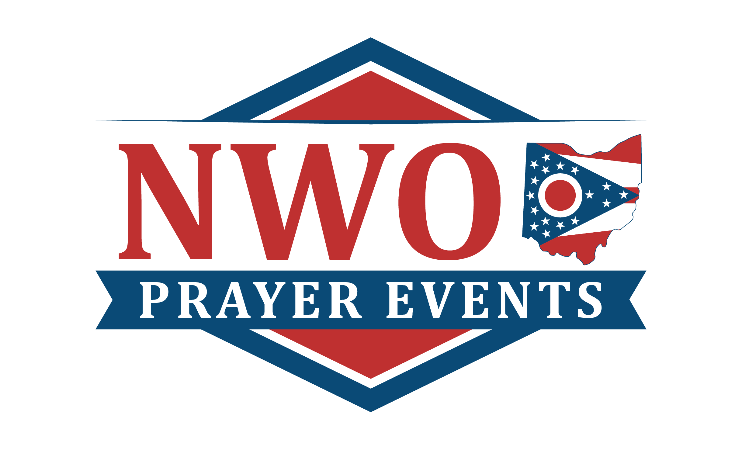
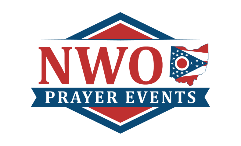
Logo
Logo Guidelines
• The logo should not be placed on any colored background, with the exception of Liberty Blue.
• The logo already has a small amount of padding built into the image files. Cropping this out should be avoided.
• While the logo can be used on a dark background, it is recommended that you use a white one whenever possible.
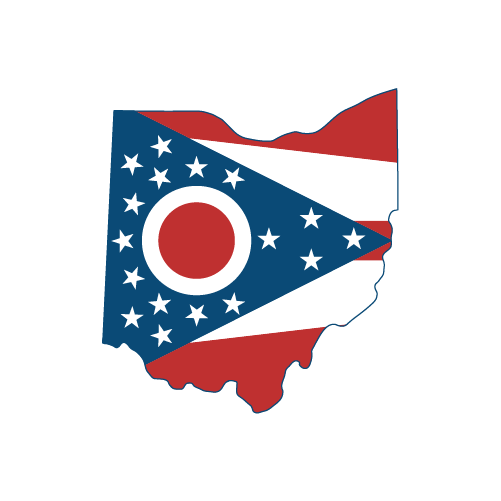
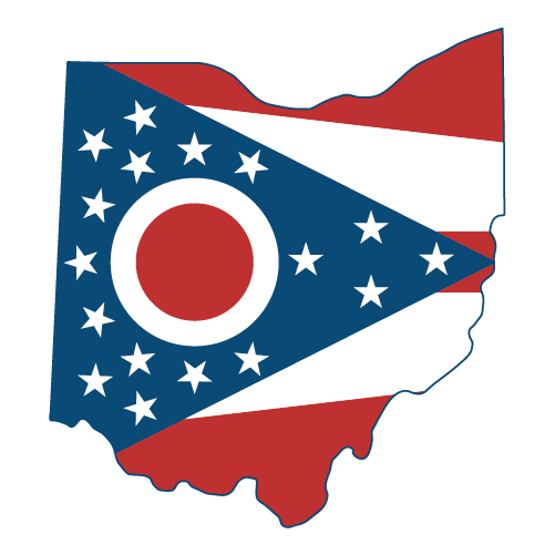
Icon
Icon Guidelines
• The icon should not be placed on any colored background, with the exception of Liberty Blue.
• Be sure to give the icon a decent amount of padding. There are versions available for download with padding built in.
Font
Inter
More Info
ABCDEFGHIJKLMNOPQRSTUVWXYZabcdefghijklmnopqrstuvwxyz1234567890 ?!()[]{}&*^%$#@~
Cambria
More Info
Cambria is the font used in the NWOPE logo, and looks best in all caps.
It is not recommended that you use this font, but if you need a serif font, you can use this one.
Otherwise, Inter is the preferred font in most cases.
Colors
Coolors Palette
•
Download as Image
•
Download as CSS Variables
Color Guidelines
• Black text should NOT be used as text on any of these background colors.
• Aurora Red should not be used for foreground text color.
• Aurora Red should be used with caution if you intend to put text over it.
• No two of these colors should be used as text and background colors together.
• Full Black (#000) should be avoided if it is possible to use one of Liberty Blue or Kettle Black.